Three sub-views: System Health for the state of the machine, Resources for live charts, and Logs for what DSM has recorded. Plus the controls that change something - fan mode, the identify light, DSM updates, restart and shutdown.
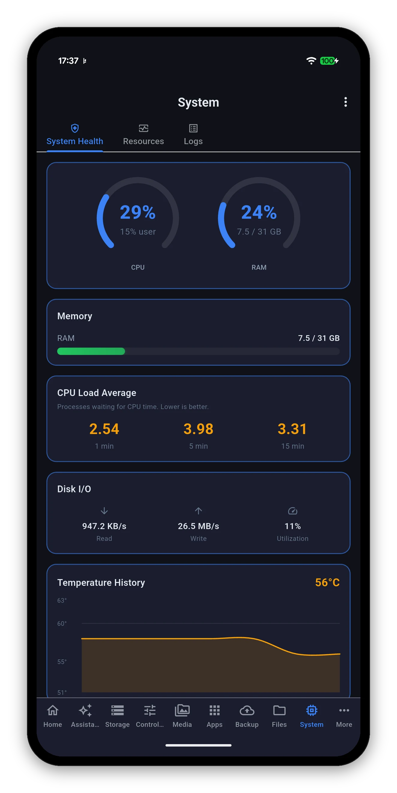
| Card | What it shows |
|---|---|
| CPU & RAM gauges | Total CPU as a ring, with the user share called out underneath so you can tell your own workload from system overhead. RAM shows the percentage and the absolute figures. |
| Memory | Used against total, as a bar. Green until it matters. |
| CPU Load Average | One, five and fifteen minute figures - processes waiting for CPU time, not a percentage. Judged against your core count, so a healthy figure on an eight-core rackmount is a busy one on a two-bay. |
| Disk I/O | Read and write throughput plus the utilisation percentage - how much of the time the disks were busy, which is often the real answer when a NAS feels slow while the CPU looks idle. |
| Temperature History | A rolling chart with the current figure. In °C or °F per your preference. |
| Processes | How many processes the NAS is running. |
The Cooling card shows fan status and the mode the NAS is in, as a three-way control:
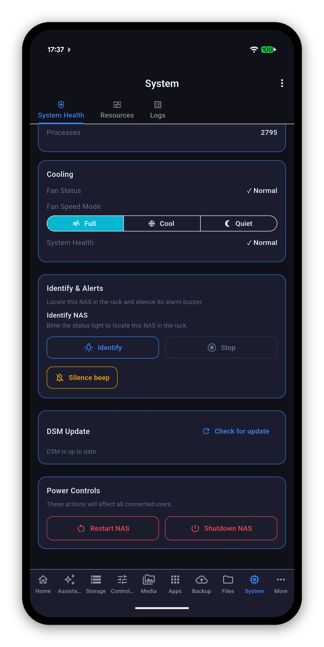
The DSM Update card reports the version you are on and whether Synology has something newer. Check for update asks the NAS to look again.
At the bottom of System Health, and marked in red, because they affect every connected user - including the person mid-way through a file copy.
synomanager://reboot and synomanager://shutdown links deliberately only open the app at this screen. A destructive action does not become one-tap because it was triggered from a launcher.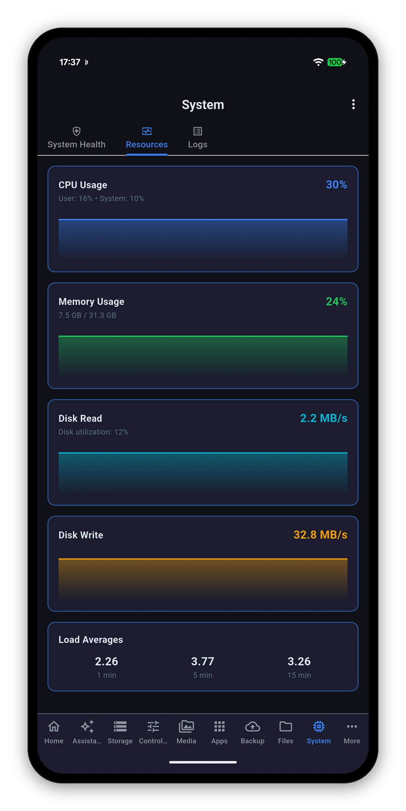
The Resources sub-view is the same data as a rolling graph, which is what you want when the question is "is this a spike or is this constant?"
Two tabs: System for DSM's own log, and Connection for sign-ins and file access. Both are read when you ask for them.
Volumes, pools, per-drive SMART health and safe eject.
 Syno Manager